Website Design Checklist
In the life of a business, few moments are more daunting than the website launch. Thanks to the world of online commerce and instant feedback, your business’ reputation hangs on how people respond to its site. Chances are, you know it all too well. By the time your website goes live, you’ve already squinted at every detail countless times. A website design checklist it helpful to guide you to hit every note.
There are endless standards to meet, targets to hit, and design trends change every year. While it’s important to pay attention to these, some guiding concepts never change. Before losing more nights of sleep tracking down every item on a website’s design to-do list, there are several broader questions you can ask to stay organized at any stage of the process.

What is the first impression my site leaves on viewers?
One of the most difficult tasks on a design checklist seems simple: scan the website as if you’ve never seen it before. Follow your gut reaction to links and navigation, and look closely at nothing.
When people visit a page for the first time, they decide almost instantaneously whether they like and trust it. A .05 second visual scan of the homepage is all it takes to form opinions and decide whether to keep reading or make a purchase. Readers also subconsciously assess how up-to-date and reliable a site is through its visual coherency and readability.
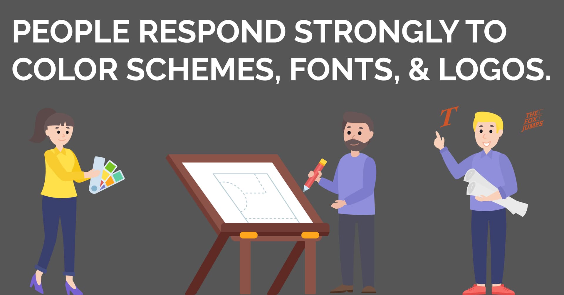
Part of this process is emotional: people respond strongly to color schemes, fonts, and logos.
On any given page, do all fonts and branding look unified? Do the chosen fonts correlate to your products or services? Is the most important information in view on first glance, or will a customer have to hunt or scroll for it? Crafting an impressive first impression is the first and last chance your site has at keeping people longer.

Is it readable and easy to navigate?
Having control over user navigation always benefits your business and site analytics. A website’s job is to guide customers effortlessly to products and essential information. Without up-front navigation buttons and clean, readable copy, this seamless experience is impossible to create.
Avoid offering too many options at all costs, and don’t overcrowd a page with long paragraphs of text. Even if the site is focused on written content, find ways to bite-size it wherever possible. Can a paragraph become a bulleted list? Can it be broken up and reoriented around product images?
Does it look and function like other websites?
You want your website to stand out. This doesn’t mean that you should ignore basic web conventions. Being unique should never come at the cost of your website’s ease of use: people should be able to understand and navigate the page in a hassle-free way.
Language, content and branding imagery are the places to get creative- not links, logos, and buttons. Your site should look and function enough like others so as not to cause any confusion or hesitation.
A storefront with a faded sign and a sticky door knob will lose customers no matter how great the merchandise inside may be. Think along these lines, follow standard best practices when it comes to logo and navigation bar placement, and ensure that links and buttons are obvious and functional.
It is important to organize content in a logical and predictable way. For example, people tend to look for reviews right below a product or service. If yours are hard to find or located on a separate page, potential customers may think your company has something to hide. Conforming to web conventions like these makes customers feel at home, boosts their trust in your brand and business, and ultimately pays off in sales and site interactions.

Is my visual media top quality and unique?
Even the best marketing language can only go so far. High-quality, convincing images will speak faster than words and stick longer in people’s memories. Make sure it integrates well with text and frames your content appropriately. Image size, type and placement will vary depending on the site’s purpose, but there is never a reason to compromise on quality.
Photos and graphics should be balanced in size so that they stand out without obscuring content, match the overall color scheme, and harmonize with fonts and branding. When it comes to product photos, crispness and clarity is especially important.
Choosing and formatting visual media can easily be the most time-consuming part of website design. But as the beginning and end of a viewer’s experience, it’s also potentially the most important.
How does my site look on a phone screen?
Without an impeccable, easy-use mobile version of your site, you are eliminating a huge majority of potential readers and customers. Getting this part right may feel like an afterthought. But don’t be fooled. If your site looks (and functions) well on a phone or tablet screen, it looks good for your business. It makes your services infinitely more accessible. Out of all the ways to prove that your company or organization is up-to-date, this is the most effective.
No matter how devilish the details, simplifying your website design checklist – and never losing sight of the ultimate goals – will iron them out and streamline the process. Being able to confidently answer these questions ensures that a site is up to date in 2020. Further, that they remain just as relevant in years to come.
Building a website design checklist
Of course, everything mentioned above is not comprehensive. Different individuals and businesses have different needs. Thus, checklists will vary.
For help navigating the design process, contact us today.