Best Startup Websites
Starting a new business can be a very daunting task. Many of us have heard the statistic that 90% of business startups fail in their first year- and this is no exaggeration.
You could have the best idea in the world, yet there is no guarantee that your company will survive. While the reasons for most businesses failing are outside the realm of website design, it is still a very important facet of your business.

A startup website does not have to be the most visually stunning web page on the internet, in fact, we find that keeping it simple and to the point is the best method. As a startup, there are a couple things you need to keep in mind while designing your website. Keep reading to find out what some of the best startup websites are doing.
Possibly nobody knows who you are or what you do- yet.
Your value proposition needs to be delivered within the first few seconds of a user visiting your website. Yes, many startups are just finding their footing. Nevertheless, the best startup websites still clearly communicate what they offer and in a visually pleasing way.
The truth is that people visiting your website likely have little to no idea on what you actually do. You do not have any brand name recognition which means you have a short time to capture their attention. According to the Neilson Group, a leading UX research firm, users spend an average of 10-20 seconds on a web page- which means you have an even shorter time to gain their attention.
Here is an example website:
Most people would agree that this web page is at least somewhat visually attractive. Although I would argue that the colors could use some diversity…but I digress. No clutter, no crazy colors and big clear text. The issue is that “The advantage you’ve been waiting for” conveys absolutely nothing to the user about what the business offers.
Here is a better example:
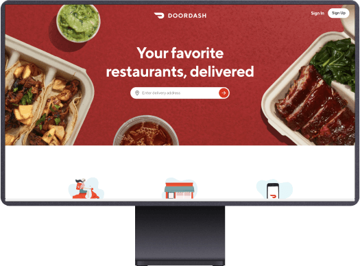
Within the first 10 seconds of visiting Slack’s homepage, it becomes clear that they offer team messaging software. It also follows some of the more basic aspects of web design such as lack of clutter, bold main text and a preview of their product. A big part of conveying your message is being solutions oriented. In other words, show the user that you exist to solve their problems. For Slack, they solve the complicated issue of workplace messaging. For DoorDash, they deliver food for when you are unable to go to your favorite restaurants. If you have created a service or solution that fits the needs of your market, make sure you convey that.
Now, you do not always have to use text to convey your product. For many businesses, using high quality pictures can be enough. Take a look at a web page we built for an Acai bowl restaurant:
Berrydivine offers healthy acai and yogurt bowls. Their main page is one large photo which shows off one of their bowls. Naturally, this works better than text in this case. One you have captivated your audience’s attention with the mouth watering bowl, they can scroll down to get more information. Again, the key here is to grab their attention enough to make them want to stay.
Want more tips on building a killer restaurant website? Check out this blog we dedicated to making your restaurant stand out!
Best startup websites – Show off your success!
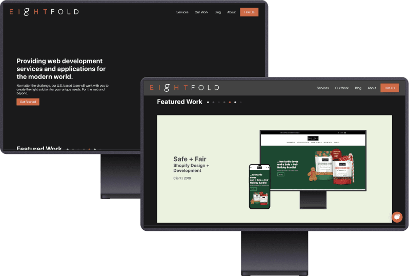
Ok, so you captured your audience’s attention by clearly communicating your product. Now, it’s time to show them that it works. Larger businesses such as Slack are able to simply put logos on their homepage to show off their clients. But as a startup, you are probably working with smaller, local businesses. Take the Eightfold homepage for example:
As a startup ourselves, we understand how difficult it can be to stand out. Which is why we have our ‘featured work’ section. This is where we present case studies and sample client websites for potential customers to view. References as a startup are paramount to obtaining new customers. Unlike with established businesses, people do not know the quality of your work so showing them can help build confidence in your business.

Doordash does a great job of this by using your location to present local restaurants for which they deliver. While this is not necessarily “showing off” their success, it does present their capabilities which achieves the same kind of effect.
Sidenote: Doordash nails the head on ‘delivering’ a clear message to their customers.

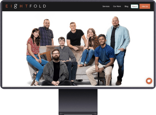
Show off your team:
One of the biggest advantages new, small businesses have over its competitors, is the ability to provide a personal touch to their interactions. Potential customers who are able to see your team will likely feel more welcomed and cared for as opposed to just hearing a voice over the phone or seeing a name in an email. Plus, it is always nice to put faces to a name. Thus, be sure to show off your team and provide information on who they are and what they do.

The best startup websites are easy to navigate, communicate who they are and what they do clearly, and ultimately bring people back.
Even with a visually stunning website which hits all the wickets, you still need to ensure that your website will generate traffic. Our team specializes in Search Engine Optimization (SEO) and can help you rank higher on search engine result pages (SERPs) to ensure that your website is getting the views it deserves. Contact us today to see how we can help you build the perfect website for your company or visit our blog to learn more about all things tech!